Tutorial: Creating Units from Photographs of Miniatures
1. Introduction
The following is a tutorial I posted in Apolyton's Scenario League forum back in 2003. It was lost when the site's administrators accidentally deleted an entire subforum. My methods have advanced a bit since then (as have graphics editors - Corel Paint Shop Pro 10 has just been released), but the basics are the same. I'm not really up for a rewrite, so here it is word for word, warts 'n' all:
This tutorial employs Paint Shop Pro 8.10 and assumes basic knowledge of its use. I have structured it to follow the basic steps I used to convert a photograph of a Viking chieftain to a Civ2 unit. It's a very simple job, requiring minimal manual work and only a handful of filters. To compensate for this, I'll present a few other examples at the end of the tutorial.
There are few hard and fast rules to my method - it's simply a case of trying things until it looks good. However, the more familiar you are with your graphical editor's tools, the more options become available to you. I have a bias towards ToT, so this tutorial will focus on creating 24-bit bmps for this game. Obviously you can apply these methods to standard 8-bit Civ2 graphics, but with poorer results.
2. Selection Criteria
The most spectacular miniatures with the most amazing paint jobs don't always yield the best results, regardless of how many filters you apply. Poorly-painted miniatures with simple features have produced some of the finest units I've seen. Of course, if there's a unit you simply must have for a scenario, there's nothing to stop you trying.
I generally look for a fairly neutral stance, where possible - I want at least some level of consistency of style. I also want to be convinced that the unit, if terrestrial, is actually standing on its tile in the game. Wild action poses don't always cut the mustard. Rich contrasting colours are best, but you can always try and improve washed-out graphics with filters later in the process. Try to avoid miniatures with too much detail. Sculptors of Games Workshop miniatures (eg, Warhammer) tend to opt for ornate styles in the most over-the-top way - this is fine if you like redrawing most of the unit because they generally look like rubbish after resizing.
This tutorial focuses on the Viking chieftain, shown below - he's not too complicated and he fits the criteria above.
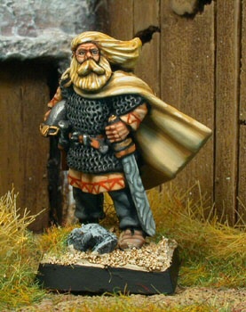
Source: http://www.twfigurines.de/
3. Scripts
PSP 8 introduces scripts to its list of new features. They are basically a set of macros which allow the automation of multiple tasks. Whilst I'll not cover the creation of scripts in the tutorial, I will offer a couple of scripts to simplify the process. They are not required to complete the tutorial, but they sure make things easier if you're trying to crank out units. They can be downloaded here.
Simply extract the two scripts into your C:\Program Files\Jasc Software Inc\Paint Shop Pro 8\Scripts-Restricted folder (default path). You will need to display the Script toolbar to use them. This is achieved by heading to the View menu → Toolbars → Script. In the Select Script menu you will find two new scripts: 1 Unit Preparation and 2 Anti-Aliasing Cleaner. To run a script, select it in the menu and click the Run Selected Script button.
To give you an easy guide to the script functions, I have included insertion points in the text to indicate what steps the scripts automate. Everything between a Script Start and a Script End comment is automated in the script.
4. Colour Depth
Open the Viking chief in PSP. Before you start anything else, make sure the source material is in 24-bit colour. If not, go to the Image menu → Increase Colour Depth → 16 Million Colors (24-bit) or hit Ctrl-Shift+0. If you forget this step, the first script will do it for you.
5. Orientation
The chief is leaning a bit to the left. I want him standing vertically. Hit Ctrl+R to bring up the Free Rotate dialogue box. Turning him 8° to the right solved the problem.
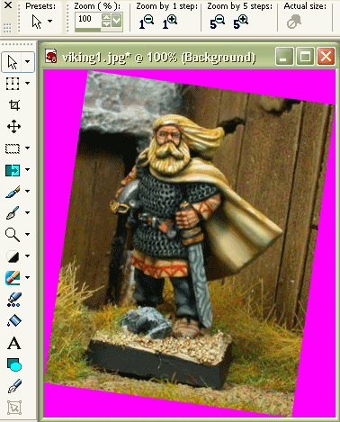
Note also that ToT will mirror units, depending on their direction of movement in the game. So unless you really prefer to see the original orientation in the game menus, flip units so they look like they are moving from left to right (if direction is implied). To flip units horizontally, use Ctrl+M. In this instance, the Viking displays a fairly open stance, slightly facing to the left, so I left him as is.
Script Start: 1 Unit Preparation
Copy the picture and paste as a new image (Ctrl+V). This gives you a point of reference from which to work.
6. Removing the Background
The standard way to remove the background from an image in PSP is with the Background Eraser tool. The tool, which appears as a transparent circle, samples pixels from its centre and erases similar outlying pixels, depending on your tolerance settings. To use it, the background must be promoted to a full layer; this means that erased portions will become transparent in the new layer. Because I actually like to be able to see what I have erased, I create a duplicate of the background first and then change the original entirely to magenta (#FF00FF). This also makes things easier later in the process.
Make sure the Layer palette is visible. If not, go the View menu → Palettes → Layers or hit F8. Click Duplicate Layer as shown below.

You should end up with a new layer called Copy of Background. Select the original Background layer in the Layer palette to make it the active layer (see below). Change the Foreground and Stroke Properties Color to magenta (#FF00FF). Select the Flood Fill tool, change the tolerance to 200 and click on the image. Nothing will appear to happen, but you have just changed the colour of the Background layer to magenta.

Click on the Copy of Background layer to make it active again.
Script End: 1 Unit Preparation
Now it is time to isolate the subject of the image (the Viking chief) from the background of the photograph. Select the Background Eraser tool. In this example, I begin with size 70, Sharpness 10, the FindEdges limit and AutoTolerance checked. Hardness, Density, Thickness and Opacity are all set to 100. As you begin to erase the background, ie, make it transparent, you will see the appearance of magenta from the underlying Background layer (see below).
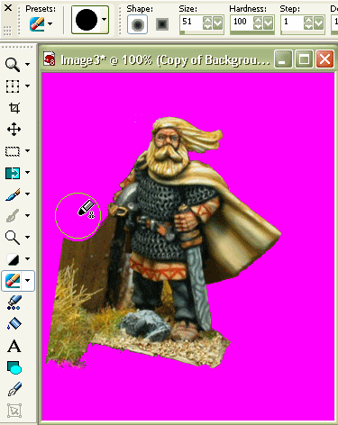
Work the tool around the subject until you have removed the background to your satisfaction. You may need to reduce the tool size and change the tolerance manually. Clean up any background residue with the Eraser tool. It shouldn't take you too long to get the hang of these tools.
Once you have removed all of the background, you are ready to resize the image.
7. Resizing
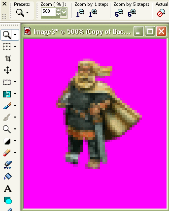
Sometimes I'll apply filters prior to resizing, but on this occasion I didn't feel the need. I have settled on a height of around 42-45 pixels for my man-sized units. The original Viking chief measures approximately 245 pixels in height: 44/245 = 0.18. We want to reduce the image to 18% of its original size. Hit Shift+S to bring up the Resize dialogue box. Select Smart Size resampling, check the Lock aspect ratio box and enter 18% for the pixel dimensions. You should end up with something like the image, below.
8. Removing Anti-Aliasing
In resizing your image, the pixels are resampled. Depending on the algorithm employed, Smart Size resampling in this case, neighbouring pixels may be 'averaged', causing a feathering or anti-aliasing effect. This is fine in the centre of the subject material, but along the boundary between the subject and the background, it becomes a problem. Civ2 does not support anti-aliasing, so you will need a clearly defined boundary between the unit and the game's transparent background mask - unless you like a glowing pink aura around all of your units.
I've used a number of methods in the past, but the following is what I've settled on for the present. Part of the idea for the method comes from a technique used for Corel Photo-Paint 11, courtesy of William Keenan.
Script Start: 2 Anti-Aliasing Cleaner
Click on Duplicate Layer in the Layer palette 10 times. You should end up with something like the screenshot below:
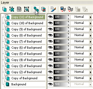
Go to the Layers menu → Merge → Merge All (Flatten). The process of replicating the image basically has the effect of increasing the opacity of the edge pixels of the subject material. These are then combined into one layer. Your Layer palette should once again look like this:

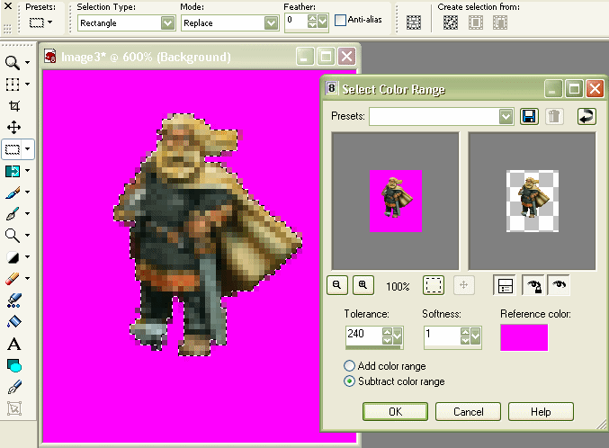
We now want to remove the remaining semi-transparent pixels from the selection. Select all (Ctrl+A) and go to the Selections menu → Modify → Select Color Range.... Since the image is now a single merged layer, transparency is replaced by magenta. Therefore, set the Reference color to magenta (#FF00FF), Softness to 1 and the Tolerance to whatever you like (see below). In this example, I set the Tolerance at 240 to remove most of the semi-transparent pixels from the selection.
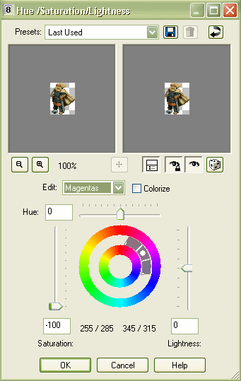
Depending on the tolerance level you have selected, there may be some residual semi-transparent pixels within the selection. I sometimes purge magenta from the entire selection using the Hue/Saturation/Lightness filter, although results vary from case to case. This practice is a bit of a hack job and I'd bypass this step if the original image contains significant amounts of magenta (If you're using the script, cancel this step, then hit Yes, when prompted to continue the script.), otherwise, hit Shift+H. You will be faced with a dialogue box like the one below. In the Edit box, switch to Magentas and drag the Saturation bar down to -100. Click OK.
At this point you may choose to remove the semi-transparent pixels from the background so that you can more easily see the boundary line - although it's not necessary. Simply hit Ctrl-Shift+I (inverse selection), make sure the Background and Fill Properties Color is magenta, hit Delete and then Ctrl-Shift+I again.
Script End: 2 Anti-Aliasing Cleaner
In most cases, I still won't be satisfied with all of the unit's edge pixels, so I'll clean some of them up manually. Using the Paint Brush tool, where necessary, I sample the inner pixels to repaint the edge. Finally, you should end up with something looking like this:
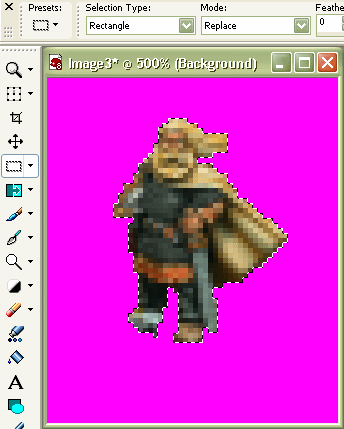
The chief's right foot, obscured by a stone in the original photograph, needs to be rebuilt. I simply copied and pasted clumps of pixels from his left boot to create the shape of the right boot. Then, using the Lighten/Darken Brush (see section 10), lightened the upper surface of the boot to create depth.
9. Applying Filters
This area is open to huge amounts of experimentation. Really, you've just got to try different methods and settings until you achieve something satisfactory - it's all intuitive. Of course, filter selection can make or break a unit, but all I can do is point you in (hopefully) the right direction.
The Viking chief, in his current incarnation, is looking a little on the flat and dull side. For such small graphics, you need to exaggerate the details to bring out the best appearance. Most people would immediately grope for the sharpness filters. My advice is: leave them well alone, unless absolutely necessary. Never touch the Sharpen or Sharpen More filters - these are way too over-the-top. Only ever use the Unsharp Mask for sharpening; it allows you precise control. I mostly use these settings: Radius: 2, Strength: 10 and Clipping: 5. The main use I have for sharpening is highlighting the face. Having selected the face only, I'll use either unsharp or contrast. I use no sharpness filters in this example.
The Viking needs some contrast enhancement. Go to the Adjust menu → Brightness and Contrast → Brightness/Contrast... or hit Shift+B. Enter 15 for Contrast. Increasing the contrast makes dark areas darker still, so increase the Brightness to 8. Click OK.
Another excellent way to improve depth on small, washed-out graphics is to increase the level of colour saturation. In PSP you can head to the Adjust menu → Hue and Saturation and select either Automatic Saturation Enhancement... or Hue/Saturation/Lightness... (Shift+H), the latter being the manual method. I have no fixed settings for either of these filters - it depends on the source material. For the Viking I got lazy and chose Automatic to see if I could get immediate results. I used the following settings: Bias: More colorful, Strength: Strong, and checked the Skintones present box.
Following colour saturation, I felt the chief's hair was a bit on the yellow side. To correct this, I selected his hair, including the beard, with the Selection tool. I then headed to the Adjust menu → Color Balance → Manual Color Correction... (see below). For the source colour, I sampled a yellow portion of the beard. I checked the Preserve lightness box and chose a preset target colour. Scrolling down the preset menu, I found Hair Colors, and lo and behold, we have Nordic! Click OK.
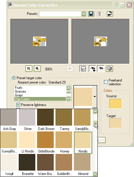
These are the main filters I use in the conversion process. I have found little use for many of the others. I almost never use anything from the Effects menu in straight conversions. I do use filters from the Color Balance group when I need to recolour a unit or parts of a unit, but this is not required here.
I fiddled with the edge pixels again, using the original photograph as a reference, but the adjustments were minor. At the end of this stage, you should have something that looks like this:
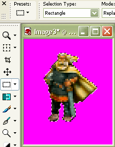
10. Touching Up Details
Many of the above filters can be applied manually to specific areas, using the Retouch Brushes in the Tools toolbar (see below). Of these, I almost exclusively use Lighten/Darken, Dodge and Burn to highlight details. When using it on Civ2 units, keep the brush size down to 1-3 pixels. For dodge and burn, keep the opacity low, say at the default 10. Keep Density and Thickness settings at 100. For Hardness I use various values.
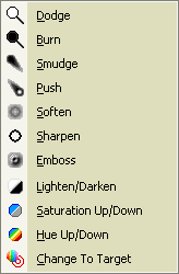
For the Viking I used only the Lighten/Darken brush on the tunic, the cloak and the boots.
11. Finishing Up
All you need to do now is paste your selection into a blank units' box. Line up the unit with the base of the magenta tile. Deselect the unit with Ctrl+D and draw in a shadow using the Paint Brush. Save your unit as a bmp file and it's ready for your next ToT scenario.

12. Loading the Civ2 Palette
To use such units in regular Civ2, FW or MGE, you will need to load the 8-bit Civ2 palette. For those who don't know how to do this: open a regular Civ2 graphic file (stick to units.gif - there are a few palette variations around) and go to the Image menu → Palette → Save Palette... Call it something meaningful like Civ2. Open your 24-bit graphic, go to the Image menu → Palette → Load Palette... and select Civ2. Done. Don't blame me if it looks like rubbish.
13. Other Examples
As I said in the Introduction, I will show a few examples of other units to illustrate various methods. Below are four examples (this is getting a bit long) with brief notes. Unfortunately, I don't have step-by-step screenshots or settings, only before and after shots.
Wizard - I'll start with the wizard because it's the oldest. I did this guy nearly 4 years ago, using more primitive techniques. I needed a white wizard at the time, so I greyscaled the robes. I ditched the sword and head of the staff, and modified his left hand to appear as though it was pointing. I manually lengthened the robe to cover his feet - these days I would use an alternative method. The bottom-left inset shows the results of lengthening the robe using the Warp Brush tool - much faster and more versatile.
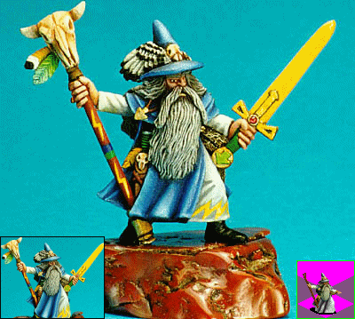
Source: http://hot-lead.org/
Cave Troll - The cave troll image has been firstly mirrored in PSP to conform with the ToT game mirroring. The troll's right arm was deleted and replaced with a mirror of the left. I modified the contrast and brightness, and then applied the Lighten/Darken brush to highlight the teeth and muscle tone.
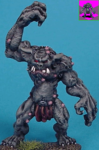
Source: http://www.paintingclinic.com/
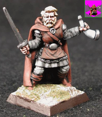
Ranger - Here, quite obviously, I've used colour saturation to shift the fairly dull red-brown to a stronger red. One drawback of using miniatures as a base for humanoid units is the lack of proportion. Numerous miniatures suffer from over-scaled heads and hands, and many tend to be pretty robust. In this case, I felt the ranger's head was over-sized and I replaced it with the head from a smaller reduction of the original image. I also applied the Lighten/Darken brush to the face to darken the eyes.
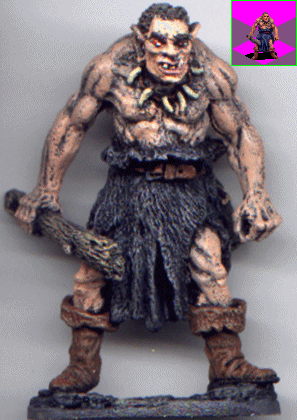
Ogre - Once again I've used colour saturation. The Lighten/Darken brush was used to darken the forehead and highlight the furs and muscle tone.
14. Conclusion
So there you go - that's how I converted this guy - very simple. I guess the key to success is how you apply your filters to different source materials. You'll just have to make your own judgements here - I'm never certain what filters I'm going to use when I start - I try things until it looks good in my eyes.
I've made a lot of dud attempts at unit graphics in my time and there are still units that, for the life of me, I can't get right. Others I have gone back to later with a different idea and have managed to resurrect. So it comes down to trial-and-error, intuition and knowledge of your graphical editor's tools. I'm still learning - it's not that long since I grabbed hold of PSP version 8 - I used scripts for the first time a little over a week ago.
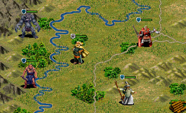
Finally - here we have our new friend enjoying the countryside in ToT prior to a campaign of rape, pillage and burn. Oh dear, he appears to have some company...
Catfish
6/09/2005
